I've got to say that we were filming for four hours straight, two consecutive days, but it was pretty fun. I don't exactly get excited by the idea of filming myself, I can come up with ideas, do story boards, direct, but actually filming it's not my favorite thing, but during these two days I surprised myself with some of the shots I got. In the end, it was a very enjoyable experience that I hope to repeat... but not too soon. Gotta rest.
Friday, April 7, 2017
Vlogs Galore
You guessed, another vlog. Here's the final part of the filming process, which resulted in a total 133 videos -16.9 GB. I'm guessing I have about two hours of footage to go through, which is oh so exciting.
I've got to say that we were filming for four hours straight, two consecutive days, but it was pretty fun. I don't exactly get excited by the idea of filming myself, I can come up with ideas, do story boards, direct, but actually filming it's not my favorite thing, but during these two days I surprised myself with some of the shots I got. In the end, it was a very enjoyable experience that I hope to repeat... but not too soon. Gotta rest.
I've got to say that we were filming for four hours straight, two consecutive days, but it was pretty fun. I don't exactly get excited by the idea of filming myself, I can come up with ideas, do story boards, direct, but actually filming it's not my favorite thing, but during these two days I surprised myself with some of the shots I got. In the end, it was a very enjoyable experience that I hope to repeat... but not too soon. Gotta rest.

Thursday, April 6, 2017
Exploring Markham
We filmed the first set of video yesterday, UHUUUU! There was a delay on the time we started filming, because Santi had an emergency and had to cancel, so we just decided to start the solo parts. Jean took us to Markham Park, a park here in Weston, which is huuuge and has a thousand different settings that we could take advantage of. Here's a little vlog of how the day went...
I think I should also give a brief explanation of what my vision for the video was. I've mentioned before that we were going for a fully promotional video, since I'm trying to expose them as much as I can. The idea of the video is to have Rafa, Carlos, and Jean on three different settings and Santi driving a car, and towards the end of the video Santi picks up each one of them and they all drive to their studio to play. In each of their settings they are playing the song, jamming to the music, which is what happens in promotional music videos. The whole video alternates between the scenes in the different settings and the studio, where they are all together playing. The special touch is that the shots in the studio are happening in slow motion (they played in a faster tempo and I'm going to slow it down during editing). I know the idea seems a little basic, but I wanted to keep it that way so I can be very creative during editing. The video of "Red Hands" by Walk Off the Earth (which I've posted before) inspired me to take that decision, because even though I think editing like that would take me WAY TOO MUCH time, I still want to create something cool and different as they did.
Excited, nervous, and restless about editing this video. I'm starting this weekend. Wish me luck.
Tuesday, April 4, 2017
#recordingsessions
 |
| A picture of Jean and Rafa to light up your day. |
I also thought of placing the lyrics right here, just in case anyone is interested...
There are those who will say
You will find your peace someday
It's your life, it's your way
There's no reason you should wait
Take a stand, hold my hand,
Let me wake up far away
But you're still picking up the pieces
Of a broken start
I'm thinking about you, dreaming about you, I'm alone (my heartbeat, my heartbeat)
I'm thinking about you, singing about you, on my own (my heartbeat, my heartbeat)
That is it. I'm ~hella~ excited to hear the final version and I hope y'all are too!
Sunday, April 2, 2017
Scheduling
One of my favorite things in this world is schedules. I love making plans and having everything figured out. It makes me happy, calm, and confident; in summary, a fulfilled Lari. The schedules can be in big scales, such as a month or a week, or in small scales, such as a day or a portion of a day. An advantage is being organized and getting stuff done efficiently, but a disadvantage is always hoping the schedules will work and being disappointed when they don't. But I have made a schedule for this upcoming week with the band (all of us together, so no one is unaware of anything) that simply HAS to work.
Monday: recording session! They are recording the song and I am taking the opportunity to film final shots for the 'doc' video and the interviews regarding "Heartbeat".
Tuesday: we are having a photo shoot and filming the general interviews (since none of those have worked so far... I am not even getting into details).
Wednesday: first day of filming for music video!
Thursday: second day of filming for music video!
Friday: going over the footage and hoping all is right in the world because Rafa will be in a plane to Brazil by the time I find any mistakes and then... well, it's beyond my control.
I am a little frustrated that I haven't had as much control over this project as I wanted to regarding when things get done; you can call me a bit of a control-freak. Still, I am putting my personal feelings aside so I can finish this. The good part is that, even with pushing dates, delaying meetings, and taking long to finish the song, I still love working with them. I truly think that working in the music industry is something that I'd be happy to do in the future. But deadlines have me FREAKING OUT.
That's it. I'm stressed. I'm going to cry. Goodnight.
Monday: recording session! They are recording the song and I am taking the opportunity to film final shots for the 'doc' video and the interviews regarding "Heartbeat".
Tuesday: we are having a photo shoot and filming the general interviews (since none of those have worked so far... I am not even getting into details).
Wednesday: first day of filming for music video!
Thursday: second day of filming for music video!
Friday: going over the footage and hoping all is right in the world because Rafa will be in a plane to Brazil by the time I find any mistakes and then... well, it's beyond my control.
I am a little frustrated that I haven't had as much control over this project as I wanted to regarding when things get done; you can call me a bit of a control-freak. Still, I am putting my personal feelings aside so I can finish this. The good part is that, even with pushing dates, delaying meetings, and taking long to finish the song, I still love working with them. I truly think that working in the music industry is something that I'd be happy to do in the future. But deadlines have me FREAKING OUT.
That's it. I'm stressed. I'm going to cry. Goodnight.
Saturday, April 1, 2017
Skeleton is a Creepy Word
It's been really fun working on the website. I don't know if I've mentioned before, but since last year with my Foundation Portfolio I have grown fond of design and now I am falling in love for web design. I have a lot of fun trying things out, changing the background, positioning pictures, creating links, and mostly trying to come up with creative layouts for the pages. It's an adventure each time I log on to Wix, because I never know what I will discover or how it will look like once I'm done. I've talked about my endless dilemma with ONLY the header, so imagine what I go through with the rest of the website... extensive work. I drew a sketch of what I had in mind for the home page, because I find sketching always helpful as brainstorming, especially when it comes to design. I find that once I put pencil on paper stuff just flows out and I can see it as a big picture.
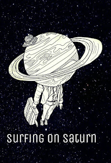
Basically what I think my home page should look like. I'm trying to keep a "space" theme -I know it sounds lame, but bare with me- to go with the name of the band and the album cover (refer to the link); I have a Saturn drawing, the circles for the news, the starry background, so that the website can act as a marketing product for the album. The more I remind people that this is what it looks like, the more it will STICK. I want it to stick. The right side of the paper is some alternatives for what I drew in the main sketch, in the case that if I transfer it to the website and don't like it, I have a plan B. (Maybe I should come up with a plan C, just in case).
For the home page I mostly followed the format of RHCP's website, regarding the content, while incorporating my own vision for the layout. I also added the documentary video as the first thing one sees when they go on the website, because introducing the band is my #1 goal. The social media links are going to be next to the menu links, but I haven't yet decided if they're going to be in a drop-down menu format (where I have a button that says "social media", you click and stuff ~shows up~) or just links. They are right there at the top with the purpose of getting people directed to their social media; the platforms are the only place where fans engage with the band, and it's important that they do so -my target audience enjoys feeling connected. Which brings me to the bottom: 'site by Wix', to give credit to the software; the logo, as a reminder to the audience -in case they have forgotten after this long journey to the bottom- of what the brand of the band is; social media links, once again, because repetition makes it permanent in one's head and I WANT IT TO STICK.
I have re-acquire my taste for surprises after working on the website so... all you get is a sketch for now. Maybe I'll show some sketches of the other pages. Maybe there will be some sneak peaks soon. Maybe you'll only see it when it's all done.
Guess you'll have to stay tuned to find out...
 |
| Sorry if pencil is hard to read, I hate sketching in pen. |
For the home page I mostly followed the format of RHCP's website, regarding the content, while incorporating my own vision for the layout. I also added the documentary video as the first thing one sees when they go on the website, because introducing the band is my #1 goal. The social media links are going to be next to the menu links, but I haven't yet decided if they're going to be in a drop-down menu format (where I have a button that says "social media", you click and stuff ~shows up~) or just links. They are right there at the top with the purpose of getting people directed to their social media; the platforms are the only place where fans engage with the band, and it's important that they do so -my target audience enjoys feeling connected. Which brings me to the bottom: 'site by Wix', to give credit to the software; the logo, as a reminder to the audience -in case they have forgotten after this long journey to the bottom- of what the brand of the band is; social media links, once again, because repetition makes it permanent in one's head and I WANT IT TO STICK.
I have re-acquire my taste for surprises after working on the website so... all you get is a sketch for now. Maybe I'll show some sketches of the other pages. Maybe there will be some sneak peaks soon. Maybe you'll only see it when it's all done.
Guess you'll have to stay tuned to find out...
Friday, March 31, 2017
Cover vs. Cover
Here is a quick post just to show you, dear followers, a dilemma.


VS.

These are the two options we have for the album cover. It technically is not a debate, since Jean paid for the top one and they've decided on it as the cover, but... I like the bottom one waaaaaay more, I think it's way cooler, it embodies the vibe of the band better and honestly, it's more appealing. I asked some of my colleagues and all of them preferred the bottom one. Of course the image needs to be adjusted, since Carlos, who drew it, didn't make that to be a cover.
In my almost-professional opinion, the bottom option will be more popular with people and more remarkable. It is a design that people can definitely remember and link back to Surfing on Saturn. Plus, it allows for cool merchandise.
Now I have to find a way to convince Jean to use the second option, but I believe I have some pretty good arguments up my sleeve.
Wednesday, March 29, 2017
Welcome, InDesign
I am working intensively on the website this week and have already made some progress; there is a sketch of the home page sitting on my backpack right now, but I will leave that to the next post. This post is dedicated to some fun I am having working with InDesign.
It all started when I started editing the website and saw myself trying to come up with a good header. I thought "it should say the name of the band", and puf, a basic, clean title saying "SURFING ON SATURN" popped up at the top of the website (yes, like magic). It looked good, yet simple, but I didn't saw that as a problem....
Theeeeeen.... because I am not too simplistic and thought something was missing, I started surfing -ha!- the web for other websites, and found that many use small logos or titles, but nothing as big as what I produced. You can see in previous website examples I posted that the name of the band does not take that much space on the page. Then I tried something else:
I liked it, especially if I made it wayyy smaller and moved it to the right a tad more (Wix has this weird thing where it starts cutting pictures if you shrink them too much), yet something was slightly wrong. I have to mention that when I began doing this my brother was doing homework right next to me, and when I am working on something I have to be constantly asking him "but what do you think?", "is it good?", "look", "should I change anything?". He gets annoyed but oh well, that's one of the guidelines for being my brother. Usually he just nods or gives short answers, but for this he actually helped. I told him I was worried the first option was too big of a header considering other websites, but he made me realize that these other bands are already famous so they don't have to THROW their name right at people's faces. Impressive, brother. I posed the question to my classmates and mentioned what my brother had said, and they all agreed with him. Also, I felt like just giving "SOS" is not going to make all people remember that this is Surfing on Saturn. Spelling out the name would be a better route.
Back to square one, but at least not making bad decisions. I wanted to stick to the logo because that is their logo and it will be used on albums, social media, merchandise, etc. Having it present on the website is important to remind people that "hey, that's Surfing on Saturn"...which brings me to:
First time I looked at it I thought it was fine, but then after a while... it wasn't anymore. My friend, Celeste, said that it looked repetitive and weird, to which I completely agreed.
Back to square one once more. I thought of having the name spelled out on the home page, and the logo on every other, but that doesn't create consistency and fixation on people's minds. I tried placing the logo on the sides, but it still looked redundant. Then I tried the footer, but it needs to be visible as soon as people get on the website. That's when my beautiful friend, Isabella, asked "why don't you use the 'O' in the logo and replace it for the 'o' in the header?"
I don't know why, Isa, but yes. Yes.
It alludes to the logo, which will be present on other elements of the website and the band's platforms in general, and still tells the name to the audience. Of course this is a rough rough draft, since it's CLEAR that the 'O' is way thinner than the rest of the letters and not even the same height, but that's what brings me to InDesign.
I basically just used it to type up the title and add the 'O' from the logo, since the program gives me the ability to adjust the font size, space between the letters, gives me many font options, and I can well manipulate the image of the 'O'. The hard part was finding a font that matched the one in the logo (a task in which dafont.com helped me a lot), but I pushed through it and succeeded ~cheers of joy~.
It all started when I started editing the website and saw myself trying to come up with a good header. I thought "it should say the name of the band", and puf, a basic, clean title saying "SURFING ON SATURN" popped up at the top of the website (yes, like magic). It looked good, yet simple, but I didn't saw that as a problem....
 |
| Attempt #1 |
 |
| Attempt #2 |
Back to square one, but at least not making bad decisions. I wanted to stick to the logo because that is their logo and it will be used on albums, social media, merchandise, etc. Having it present on the website is important to remind people that "hey, that's Surfing on Saturn"...which brings me to:
 |
| Attempt #3 |
Back to square one once more. I thought of having the name spelled out on the home page, and the logo on every other, but that doesn't create consistency and fixation on people's minds. I tried placing the logo on the sides, but it still looked redundant. Then I tried the footer, but it needs to be visible as soon as people get on the website. That's when my beautiful friend, Isabella, asked "why don't you use the 'O' in the logo and replace it for the 'o' in the header?"
I don't know why, Isa, but yes. Yes.
 |
| Attempt #4 |
I basically just used it to type up the title and add the 'O' from the logo, since the program gives me the ability to adjust the font size, space between the letters, gives me many font options, and I can well manipulate the image of the 'O'. The hard part was finding a font that matched the one in the logo (a task in which dafont.com helped me a lot), but I pushed through it and succeeded ~cheers of joy~.
 |
| Final version |
Subscribe to:
Posts (Atom)