Friday, March 25, 2016

Digressing

I'm just passing by to say that I am in love with this magazine: Metrosphere!

Found it on Issuu, which is my new best friend
Metrosphere is the lit mag of Metropolitan State University of Denver, and it showcases the work of students and alumni. Pretty cool.

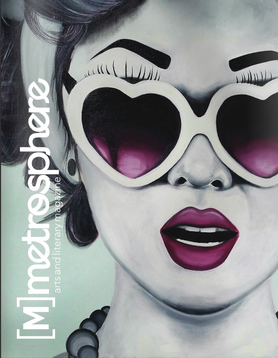
I love their masthead because it really establishes the brand. On different issues they have it placed on different places, which I think is awesome, for it follows the idea of "creativity in a lit mag"; they also change the color to go with the cover image. I chose to show this cover because of the placement of the masthead, which is rather unusual but still works perfectly -the eyebrows are an important part of the image to create the girl's expression, and that'd be covered if the title was on the top, and because the face is mostly located on the right, the title completes the "empty space" on the left. Metrosphere inspired me to play with my masthead as well: I wanna create something versatile and simple (I'm already working on some sketches and probably will have them up in the blog by next week), which creates the brand of 1867 at the same time.

Everything in the magazine is just so beautiful


Also, as it can be noticed, NO COVER LINES. Why is that, one would wonder? It is because literary magazines don't have cover lines. Cover lines work mostly to attract the audience's attention and present some of the strongest articles inside of the magazine, but lit mags are not about that life. (Yes, I am relatively happy to be saying this right now). All the pieces featured are important, and the audience is -the majority of times- completely established, getting the magazine through subscription. I know I talk about the love for the art and appreciation for the work, but that's because it is true -if it wasn't, I wouldn't say it. I've shown some covers in my earliest posts, and yes, none of them have cover lines. (This is my way of explaining why MY cover won't have cover lines).

Another thing is: I've come to announce that, unlike I had said on my "Not So Random Poem", I won't be having a title for each edition of the magazine. That goes with my decision to have a versatile, simple masthead. But more than that, the mag will hypothetically be composed of submissions, and I can't hypothetically count on people submitting works that fit a theme -unfortunately. Also, the beauty of a lit mag is the variety, the multiple styles and meters and formats. I don't wanna be constrained by a theme.

I have said that I'd be focusing on the table of contents this week, and I AM, TRUST ME, but as I was looking through some mags I came across this one and -epiphany. I couldn't contain it: I had to let my mind think about my cover for a two seconds. This is the outcome of those two seconds.


"Metrosphere Archives - My Met Media." My Met Media. Web. 25 Mar. 2016. <http://mymetmedia.com/category/metrosphere/>. 
"Metrosphere_11/2014." Issuu. Web. 25 Mar. 2016. <https://issuu.com/themetonline/docs/metrosphere2015_1>. 

Thursday, March 24, 2016

Who Cares about the Staff?

One of the sections of my magazine will be "From the Staff", where a member of my hypothetical staff describes, over dramatizing and romanticizing, an event in his/her life. That's a fun -maybe not fun, but creative way- to have an interaction between the hypothetical staff and the readers -it creates an emotional connection. I haven't seen any lit mags that have any section relatively familiar to this, but I'm choosing to innovate and be creative -in fact, those are the two reasons why I chose to do the magazine in the first place. The section does resemble teenager magazines, which have little spaces dedicated to telling an event, whether it is from the staff or a reader, and I guess I was inspired by that. But I am transforming the simple fact-telling into storytelling, bringing the beautiful magic of literary devices to "From the Staff".

I created one of my own to demonstrate how that would kind of go, and that's also the title I'll be using on my TOC (I have linked the google doc with the piece below). Bare in mind that this actually happened to me, back on a mid-summer night in 2014.

https://docs.google.com/document/d/1-qiKGZif_m-MuM_Nq1sKkgqcJmCZ85o_z6L7UVs53Jo/edit?usp=sharing

Third demonstration of writing skills on the blog. I hope I'm not becoming annoying.

Contents of Productivity

Please hear it from the drum roll... I'M WORKING ON MY TABLE OF CONTENTS! Yay, me being productive, how cute. Proud of myself.

So anyway, I'm doing this. First, I've been looking over my sections and I'm feeling much magazine and little literary, so I decided to cut out the news section. Yes, I know, terrible loss, but when I first decided to mix things up a bit I was still hoping to hold the artsy feeling of a lit mag, and I personally feel like I'm killing the artsy feel slowly. That's bye, bye, news. Second, I got my TOC (that's table of contents, I'm gonna write it like this from now on because it's easier) written down.

I'm proud of myself

Third, let me explain some things about the TOC.
  • The prose and poetry pieces are ones that I wrote -expect for three, who I borrowed from my friend- and am using the title to create the table of contents.
  • I decided to use my teacher's idea, Mrs. Stoklosa, to have the Op-Ed be about the digitization of literature -a.k.a. E-books. I think that's a very wide topic and it has become huge in the literary world -New York Time's best selling list even has a section for E-books-, so it'd be great to explore it. I'm thinking of two contrasting op-eds, one of someone who's pro the digitization, and one of someone who's against.
  • The review (which can be noted, I change to review/interview because that way it can vary) was inspired on an Op-Ed I read last year, on New York Times. It was Stephen King talking about how productive a novelist can be, and I think he has a good point. But because King himself is a VERY productive novelist, I thought of having a review on his newest book Finders Keepers embedded on an interview with King about his productivity. 
  • I've established that my target audience is adults, but I'd love to create an appealing magazine for young adults to read also, so I've decided that the comedy section will appeal to this younger audience. I got the inspiration when, while I wondered through Twitter this afternoon, I saw many tweets on Hannah Montana's 10 year birthday. So I thought: this audience is made of people in my age group, and my age group grew up watching, among other stations, Disney Channel. One thing that we are, COLLECTIVELY, always complaining about is how different Disney Channel is right now -and yes, maybe it is because we have grown and matured, but the shows are also worse, because we haven't grown and matured that much. Plus, many adults did watch at least a little bit of Disney Channel if they have kids. (Kind of an universal theme). And in the case of Hannah Montana, everyone knows who Miley Cyrus is and that before she became a short-haired promiscuous figure, she was a sweet, innocent girl playing Ms. Montana. There is also the fact that so many Disney artists grew to take a place in pop-culture. A lot to explore withing this subject, and definitely many jokes to be made. 
1966 table of contents
But moving on from the theoretical part (although it is my favorite, because the practical part involves my perfectionist self going CRAZY), I'm thinking of the design right now. I have been looking into some literary magazines, and what I noticed is that most of them have a really clean look. (By the way, I have found this website called issuu that has tons of free magazines as digital versions). Much like the rest of the magazine, the table of contents presents a clear, simple background, is very organized, but still gives out the "feel" of the magazine. 

580 Split table of contents
1966- Every edition presents the TOC the same way, including the title -but of course, changes the name of the pieces-, which creates a brand for the magazine.

580 Split- I love how everything is very organized and neatly divided, and the lines sort of create a path. The doted lines are repeated throughout the whole magazine, and orange is the color of the issue.


Elysium table of contents -a.k.a. the literary magazine from the high school that
always beats my high school's lit mag on competitions.
Elysium- it is not AS clean as the two other ones I presented, but it still is. The background gives a different look to the pages, but it doesn't distract the reader's eyes from the actual content. But like the two previous magazines, the background is a technique used throughout the magazine -a creative choice. But I really like how the pastel colors match and give a calming look to the TOC.

Yes, I want to follow this clean pattern, mostly because the focus should be on the art more than anything else. I don't want distraction from the so carefully chosen words of the hypothetical writers that wish to share their souls with the world -that's something that should be respected and appreciated. I will be working with InDesign and Photoshop to create my magazine, and I should be starting the table of contents as soon as I finish this post. I'll be posting about my progress or creative blocks, don't worry. But until then, that's it. 


King, Stephen. "Stephen King: Can a Novelist Be Too Productive?" The New York Times. The New York Times, 27 Aug. 2015. Web. 24 Mar. 2016 <http://www.nytimes.com/2015/08/31/opinion/stephen-king-can-a-novelist-be-too-productive.html>. 
"Enjoy the Largest Collection of Free-to-read Publications from Incredible Publishers around the Globe." Digital Publishing Platform for Magazines, Catalogs, and More. Web. 24 Mar. 2016. <https://issuu.com/>. 
"English Graduate School | 580 Split Literary Journal | Mills College." English Graduate School | 580 Split Literary Journal | Mills College. Web. 24 Mar. 2016. <http://www.mills.edu/academics/graduate/eng/about/580_split.php>. 
"Elysium Literary and Arts Magazine 2015." Issuu. Web. 24 Mar. 2016. <https://issuu.com/elysiummagazine310/docs/elysium_magazine_2015>.

Wednesday, March 23, 2016

Not So Random Poem

I have been thinking -yes, nice, very good, thanks. I have been thinking and I've been thinking hard
And I've just decided I'm going to turn this post
Into a poem
It won't rhyme
and it won't be deep
But it will be divided into stanzas
So we'll call it poetry

I've come to announce
That my magazine will be out
Four times a year
Because lit mags are very clear
On their target audience
And mine is completely set
But also because
I find twice to be too little

I've also been thinking
That for every edition
I should have a small title
Summarizing the theme of the issue
Which will make each 1867
Special in their own way
And will make my life harder
Trying to (hypothetically) find pieces
That match each other

But most importantly
I've come to the conclusion
That the art should always
Be together in a section
            -the Art Section
Because it is to be admired
In its own separate time
And that's a convention
From the majority of lit mags
I would like to keep for mine

This post was meant
To explain many decisions
I've taken in this last week
And didn't think could become
A whole post each
So here I am now
Sounding totally nerdy
For turning a post into
Silly, raw poetry

(Some parts kind of rhyme, I'll give myself that)

Tuesday, March 22, 2016

Flow of Creativity(-ish)

Yes, I am working on my table of contents -slowly but surly. I WILL have it done by the end of spring break -this is a pinky promise I have made to myself, and I take pinky promises very seriously. But I am a writer working on a literary magazine, so everything I write asks me "Should I be your two-page spread?". The answer most times is 'maybe', but eventually it is 'yes'; I've said yes to more than one piece, and I only have one two-page spread. Is the problem clear? Okay, good. To be honest, I don't consider myself a very indecisive person, but I'm never fully confident with my work, which leads me to ask for many different opinions. So now that I have a blog IT'S EASY AND FAST TO ASK FOR AS MANY OPINIONS AS I WANT. When would've I imagined that I'd like the idea of having a blog? (The answer is never).

This is a poem I worked on a while ago and came across this week. I like to think of it as Charles Bukowski-like, simple but meaningful, (mostly because he's my favorite poet and idol) and it is one that I could consider as my two-page spread. I think I'm better off with prose, because I'm a stronger prose writer, but it doesn't hurt to share. 

Fabricated Safety
Seven billion people in the world
And that’s all we are
Numbers.
Statistics
On screens
On their screens
Altogether collaborating
Unwillingly
In the manipulation
No
Creation
Of this world
A fabricated world made up of pixels
And search histories
And social media
And the constant processing of information
My information
Your information
Our information
Ones and zeroes
Zeroes and ones
Which contains a thousand intricate functions
To make you feel untouchable
People can’t access your Instagram
If you don’t allow them to
While your Google search is determining
What you buy
What you listen to
What you like
And we accept it as a norm
It is how the world works
It is how it’s supposed to
You lock your door every night
You feel protected
And post your life on Twitter
For friends
Acquaintances
Rapists
Terrorists
To see
Your online bank account password has 13 characters
You feel safe
But if you stop spending as much
Your bank calls you to ask
If everything is okay
Is everything okay?
You are just a collection of digits
Working as a group to add up and compose
The perfect realities
Delivered in a silver plate just for you
So you can continue to play your role
In their world
Which is consequently
Our world
And there is no secret to numbers

Second demonstration of writing skills in the blog. Cool.

Now I'm gonna force my friends to read it and give their truest opinion -as long as they don't make me cry.