 |
| TA DA! |

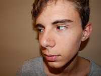
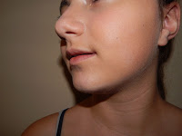
 Don't judge the pictures too harshly, please. The composition was INTENDED -I didn't simply take pictures; I had a limited window of time, these children were complaining throughout the whole thing. I focused on the features I wanted and positioned them in a way that the flash would hit such features perfectly. (Barely can call me a professional photographer, but hey, I got the job done.) Pictures taken, Photoshop called, and I, eager to play with the many brushes and pencils and pens (IT IS INCREDIBLY FUN OVER THERE, I SWEAR), started editing the pictures...ops. My idea was to embody my palette on the images, and I achieve that in a way... just not how I was imagining it.
Here's what I came up with after playing with my sister's picture:
 |
| The colors embodied in a way that I can't explain -again, my brain is funky. |
I thought it looked cool and combined it with my brother's edited picture:
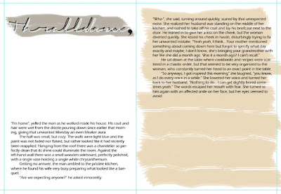
That's when things didn't work out. See, the colors are the same, but while my spread has this classical aura to it, the image has a more modern touch. It simply didn't match. So I had to compromise and let one of them go.
Bye, bye, spread.
But it wasn't a hard decision -I can change the two page spread to have a modern look, but it would take me three times the effort and time to make the pictures look like paintings. Also, I really liked the images, and I can make a theme out of it for the whole magazine. The cover I was thinking at first already owned some of the features of the above image, I just didn't know, since it was all in my head. But now that I've concreted it, I've realize that this is exactly what I want.
I have been working tirelessly on this. The only reason why I'm not posting the door image is because I've realized that I have given up too much of my magazine already, and I'd like to add some surprise element. But really, I am feeling behind and this is NOT GOOD AT ALL. It's time to turn the theory into practice. So right now I'm going to open Photoshop and get to work, because I can already feel the Deadline Desperation symptoms manifesting.
No comments:
Post a Comment