Thursday, April 7, 2016

Endless Changes

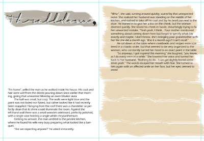
On my last post I wrote about the revolution provoked by a color scheme; this post, therefore, is dedicated to the outcome. I started with the font. I found this one, which is beautiful and classy and kind of hard to figure out, but it's very artsy and worth the effort. Then I just felt it, an epiphany, and next thing I saw was a two page spread done in front of me.

TA DA!
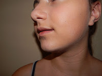
I used Photoshop for that, because I wanted the imitate the brush strokes and really, have total artistic liberty. The empty spaces are where I intended to put my images. The white would have a door (if you read the story it will make sense), and the rose/beige/I-don't-what-to-call-this-color would have the image of a woman's mouth and a men's eyes, and he'd be looking at her. So I obliged my siblings to be models for ten minutes (which ended up being twenty), and took some pictures of the annoying children. 

Don't judge the pictures too harshly, please. The composition was INTENDED -I didn't simply take pictures; I had a limited window of time, these children were complaining throughout the whole thing. I focused on the features I wanted and positioned them in a way that the flash would hit such features perfectly. (Barely can call me a professional photographer, but hey, I got the job done.) Pictures taken, Photoshop called, and I, eager to play with the many brushes and pencils and pens (IT IS INCREDIBLY FUN OVER THERE, I SWEAR), started editing the pictures...ops. My idea was to embody my palette on the images, and I achieve that in a way... just not how I was imagining it. 

Here's what I came up with after playing with my sister's picture:

The colors embodied in a way that I can't explain -again, my brain is funky.
I thought it looked cool and combined it with my brother's edited picture:


Then I thought it looked double cool and added it to my two page spread...

That's when things didn't work out. See, the colors are the same, but while my spread has this classical aura to it, the image has a more modern touch. It simply didn't match. So I had to compromise and let one of them go.

Bye, bye, spread.

But it wasn't a hard decision -I can change the two page spread to have a modern look, but it would take me three times the effort and time to make the pictures look like paintings. Also, I really liked the images, and I can make a theme out of it for the whole magazine. The cover I was thinking at first already owned some of the features of the above image, I just didn't know, since it was all in my head. But now that I've concreted it, I've realize that this is exactly what I want.

I have been working tirelessly on this. The only reason why I'm not posting the door image is because I've realized that I have given up too much of my magazine already, and I'd like to add some surprise element. But really, I am feeling behind and this is NOT GOOD AT ALL. It's time to turn the theory into practice. So right now I'm going to open Photoshop and get to work, because I can already feel the Deadline Desperation symptoms manifesting.

Tuesday, April 5, 2016

The Story of a Scheme's Power

Colors are truly something. Imagine what would it be like to live in a world that's only black and white. No shades of grey -just one or the other. Imagine what would it be like to no associate dawn with the blend of blue and yellow and orange. Imagine what would it be like to lose an entire spectrum of adjectives. Imagine what would it be like to not have a favorite color.

This is the story of how a color scheme changed the design of my whole magazine.

As I have posted, the design for my table of contents was pretty much done. I had the whole discussion with my peer and teacher about it, came home, processed everything and decided to do the following: I'd go to school and ask people around. And so I did. There was mixed feelings about it, but the common reaction was "It is a bit overwhelming at first, but when you stop to read it, it makes sense". Tried figuring out other ways to layout it -didn't work. So I had another discussion with Mrs. Stoklosa and she said that the table of contents needs to meet its set requirements; mine does not.

I came home, bummed out, pretty hopeless, but of course, I sat in front of the computer and got to work. "You have to progress", I told myself. "You have to have SOMETHING done today." Finally, I gave up on my table of contents -for the mean time- and decided to start my two page spread. I clicked on Illustrator, which had spent the entire day sitting on my desktop, waiting for me to play with it, and created a new document. A new, white, plain document, awaiting so many great things that I panicked for a second, not wanting to disappoint it. "What now?", I asked myself. "I don't know", I replied. "Oh, what about looking at some covers? Yes." -I have no idea why my mind thinks the way it does, honestly.

Cute, cute, and cute.

On the second group meeting we had, among the people in my group there was Suzie, and she shared a VERY cool article with me, which ended up serving as inspiration. The article features 70 magazine covers and they are all oh so beautiful. As I was scrolling down I noticed a pattern: even though most covers have a lot of color and movement going on, they manage to keep a clean, elegant look, and still look super artistic. I was jealous during the process, thinking about the ingenious mind of the people who create these magazines, but I got inspired.

So I resorted to my second best friend, Google, and searched up "color schemes". Looked around for a bit until I found this beauty (to the right, which is actually some painting I made with Photoshop while I was testing the colors). I simply love all the colors. The beige is really neutral and can be used to contrast with the other two colors, but it also stands out against white; the lilac brings a feeling of luxury, elegance; the blue has a calming effect, an easy color -going all color psych right now; plus, this brush effect I've used creates the artistic side of the magazine. All that embodies the "feeling" I'm trying to bring for 1867.

But colors weren't enough -I needed more. During class today it was suggested to me to use the circular shape with a bunch of words inside on the cover, and that suggestions stuck. So as soon as I saw the color scheme I thought about eliminating the circle from the TOC, and instead playing with the colors, that way I could move the circle to the cover -and, really, still play with the colors. In a second, everything became quite clear in my mind. The cover will be very simple, but powerful at the same time; the two two-page spread are becoming something new -the mix between the conventions and my own idea; the TOC will be clear and neat, but playful. And yes, this is not much information about anything, but it soon enough will be.

I should have my two page spread done later today, and I'll get started on the cover right away. After the traumatic experience with the table of contents I'm leaving it for last now.

If I don't get enough sleep because I'm working on a total different magazine now, I'll blame it on Google and its insane habit of providing easy accessibility to color schemes.


"70 Most Beautiful Print Magazine Covers." Design Dose. Web. 5 Apr. 16. <http://designdo.se/70-most-beautiful-print-magazine-covers/>. 
Monday, April 4, 2016

The Struggle is Real

This week is the week I die. I have faced the horrors of designer's block in the face and I got to say, it wasn't pretty. I am panicking on the inside, but trying to keep the pose on the outside, because if I don't, people might get concerned.

I thought I had my TOC under control, that the sketch was good, the design was going great... but I didn't. Oh what a delicious cherry on the top of this already messed up Mondae (I'm sorry, I'm tired). After working tirelessly with my new best friend, Illustrator, for three consecutive hours, I had a final product that seemed to me really great. I did stray away from the clean look, but it isn't visually polluted, it's just artsy. Here it is:

Personally, I loved it.
That's not all -this is where the real content is, the names of the pieces with their respective page numbers- there is more to the page, but that's the second phase. I decided to play with the sizes and disposition within the circle and the outlining. I read it over not one, not two, not three, not ten, but around twenty times and I couldn't see any problems. But as I was asking for my classmate's opinion, Santi, he brought it up that it seemed too clustered. I explained that I was looking for an "artsy" look, that it is the table of contents of a literary magazine, which doesn't follow conventional patterns of magazines, to which he responded with "you should try not too conventional, but a little more conventional".

After this conversation I started overthinking (which was good, actually, thanks Santi), because I realized one thing: yes, literary magazines break a lot of rules, but the MAJORITY of the table of contents I have seen and researched are quite simple and straight-forward. Most of them have their own "signature", their exclusive look, but they are not going full artistic route like I am here. So I asked some other people what they thought of it, and most said it looks really nice, I just have to work on arranging the space better.

I realized, then, that I don't really care about the rules or non-rules, breaking or following or challenging. All I really care right now is creating my own brand, my own look, my own signature, my OWN magazine. Over this past four weeks I have grown so passionate about this, that I'm surprising even myself. I have made research after research after research, and yes, I've gathered a lot of knowledge and got much inspiration, but now I am adding my own sugar, spice, and everything nice. I understand, from my research process, what works with the audience, but to be honest, when working with an audience like mine, the artistic risks are more likely to receive a positive response. These are people who are buying magazines for the sole purpose of reading prose or poetry from unknown writers, and seeing artwork from new artists. If not taking risks with them, then with who? And what if I am doing something very different? If there weren't people out there challenging the conventions and innovating we wouldn't have half of the things we consider usual nowadays.

But even though I want to go full out rebellious, I understand that a magazine is a magazine, after all, and a table of contents needs to do what a table of contents needs to do. It is supposed to inform quickly and effectively. So I have decided to take the path "less traveled by" -no just kidding; I've decided to take the middle route. I am working right now on having more space between the titles, things more even, the numbers closer to its owners -you know, making it easily readable. (Don't understand why people wouldn't want to pay attention to a table of contents if it's nicely composed, but let's just conform with human nature). That way I can please those who like the "easy on the eyes" table of contents, and still be creating something unique. Something new.

And in the words of Barney Stinson: New is always better.